Infographic
Which design principles did you use to create your infographic in Canva? Which elements of a ‘good infographic’ were you able to incorporate? What other principles did you consider?
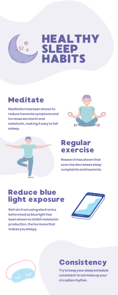
The design principles that I focused on in my infographic were leveraging contrast, optimizing colour, and utilizing white space. In my infographic, I used purple areas in the white background to highlight specific areas and to keep the infographic interesting. I also used a complementary pastel colour scheme which creates a sense of harmony in the infographic. Lastly, I kept adequate white space in between each section to improve usability and reduce cognitive overload, as a cluttered infographic would be overwhelming to the reader. The good infographic elements that I used is making it practical value and visual appeal. My infographic provides information on healthy sleep habits in a clear and concise format with visual appeal aspects that link each section of text to a visual element. Another principle that I considered was balance, I used an asymmetrical distribution of objects, colours, and texts. Also, the principle of repetition was used in the alternating left and right texts and background elements to keep the infographic interesting and consistent.
I designed my lesson plan around proper sleep hygiene and sleep disorders.
Backwards Design
I found the concept of backwards design to be interesting and realized I have seen it used in a real-world scenario. While working at the Ministry of Health, the divisional I worked in had these Divisional Priorities which served as the end goal of the division and had different objectives to accomplish these goals. I like how backwards design is not just applicable to education but can also be applied to many different scenarios.
Hey Thomas, I enjoyed reading your blog post about sleeping habits. The structure and colour theme of your infographic allowed for the proper expression of the themes present in your topic. I found that it took me a little longer to understand how to organize the images and stickers on my Canva page. Were they any problems you ran into while creating your infographic?
Thomas! Your infographic was visually appealing and to the point, great work! The colour palette was particularly engaging and overall feels balanced. You mentioned the word usability in your post and this caught my attention! If you’re interested about more design principles, I’d like to share Nielsen’s Heuristics. I learned about this concept in HINF350, “Human Aspects of Health Care Information Systems”. It’s a great rule of thumb when it comes to providing good user experience!
Hi Thomas, I really liked how you explained the key design principles that you incorporated in your Canva infographic. I agree that you leveraged contrast, optimized colour, and utilized white space because you used complementary colours that make the text easy to read, and you efficiently used white space to reduce cognitive overload. Also, I think you did a great job incorporating the principle of repetition by alternating the text boxes and graphics left and right, which made the infographic really stand out to me. This is a great way to create symmetry and consistency in an infographic. It was clear to me that you kept in mind many design principles when making your infographic. Great work!